
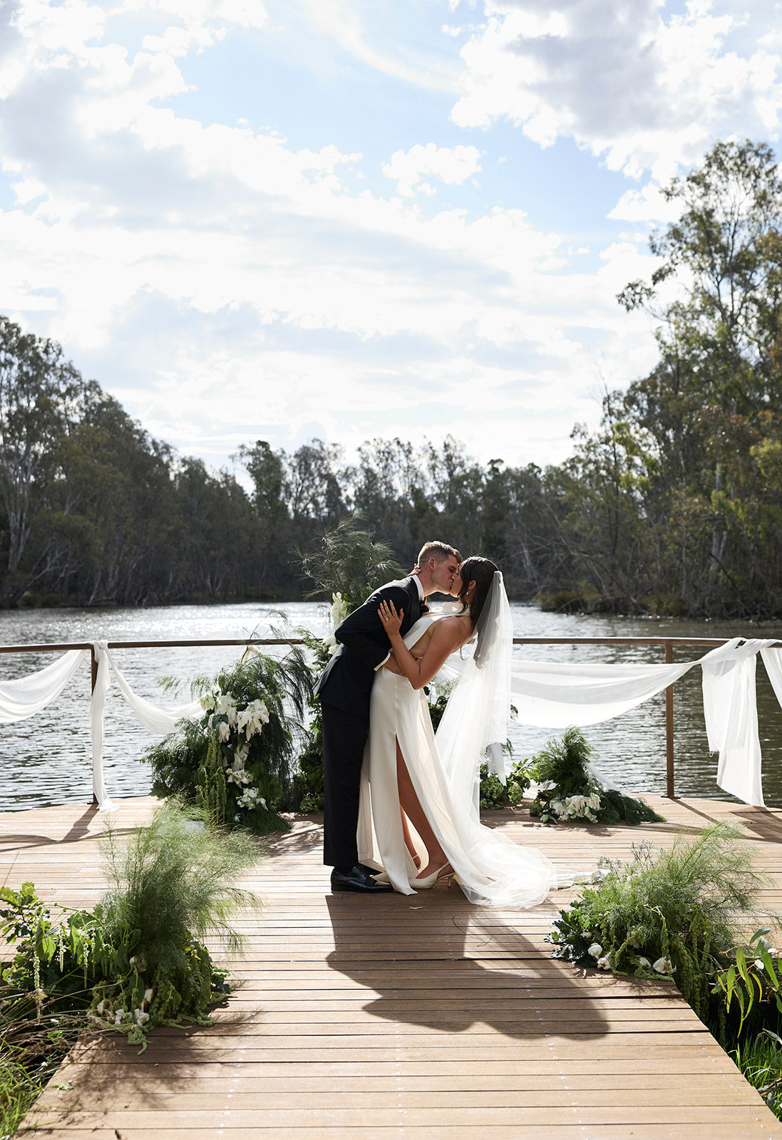
Why colour comes first
Long before a single flower is chosen or a venue booked in, most couples already know their colour palette — or at least, the feeling they want their wedding to have. Colour sets the tone for everything else, and your stationery is usually the very first place guests will see it in action. A save the date arriving in the letterbox is, for many of your guests, the first hint of what kind of day they're being invited to.
Because it touches every part of the day — from the invitation through to the seating chart your guests read as they walk in — your wedding colour palette is worth deciding early, and deciding well. Here's how to choose one that feels considered rather than accidental, using the eight core tones available across every Just Hitched collection.
Start with a mood, not a swatch
Rather than beginning with a specific colour, it helps to start with a feeling. Ask yourself what you want guests to sense when they open your invitation: romantic and soft, rich and dramatic, timeless and refined, warm and earthy? From there, the palette tends to choose itself.
Soft and romantic: Rose, Ivory & Blush tones
For couples after something gentle and heartfelt, Rose paired with Ivory is one of our most popular combinations — soft enough to feel delicate, warm enough to avoid looking cold or corporate. It suits garden ceremonies, marquee receptions, and any wedding leaning toward the romantic end of the spectrum. It's a natural fit for our Romance and Whimsical collections.
Rich and dramatic: Burgundy & Cherry
If your wedding leans toward the dramatic — think candlelit receptions, deep florals, velvet and brass — Burgundy and Cherry bring a richness that photographs beautifully in both daylight and evening light. These tones pair particularly well with our Elegance and Heritage collections, where deeper colourways sit alongside classic typography.
Warm and earthy: Chocolate & Sage
Autumn and winter weddings, or those held in vineyard and rustic settings, tend to gravitate toward Chocolate and Sage. This pairing has become one of the defining palettes of the past few Australian wedding seasons — earthy without being rustic-kitsch, and equally at home in a barn reception or a city rooftop styled with greenery.
Timeless and refined: Blue, Ivory & White
For couples who want their wedding to feel classic now and in twenty years' time, Blue alongside Ivory or White is difficult to go past. It's a palette that suits formal city weddings and coastal ceremonies in equal measure, and it's the combination we see most often in our Classic collection.
Choosing across your whole suite
Once you've settled on a palette, the easiest way to keep it consistent is to choose it once, at the very beginning, across your entire stationery suite — from save the date through to your welcome sign and name cards. Every Just Hitched collection is available across all eight core tones, so your palette carries through every touchpoint of the day without needing to re-match colours between products.
A tip we give every couple: order a physical sample in your top two colour choices before committing. Colour reads differently on screen than it does in hand, and small details — the exact shade of Sage, the warmth of a particular Ivory — are worth seeing in person.
Bringing it all together
Your wedding colour palette doesn't need to be complicated. Pick the mood you want to create, choose one or two core tones that reflect it, and let that same palette run consistently through every piece of your stationery. It's a small decision made early that quietly holds the whole day together — and it's often the detail your guests remember most.
You can preview every colour option live across our full range in our collections, or explore how each tone looks across a complete suite on our How It Works page.